student achievement gap analyses
Ongoing data science fellowship with the University of Michigan Center for Academic Innovation
hiring process
In the spring of 2019, I was interested in different ways of collecting data online, mostly using Python. I developed a number of web scraping projects, with focus ranging from flight data to college course statistics.
In one such project, I collected data provided by the UM Center for Academic Innovation regarding course evaluations. I did so because while the website on which the data was hosted provided some intuition of the data, I was interested in making my own visualizations comparing many courses in aggregate. Unfortunately, my code had a bad interaction with the website’s database, causing it to crash multiple times and my umich account to be suspended.
I was contacted by an administrator who at first reprimanded me, and then asked what I was using the data for in the first place. I showed him some of my plots and he suggested that I apply to work officially with him as a data science fellow, through the University of Michigan’s Center for Academic Innovation (CAI). I began working in the fall of 2019.
personal contributions
As a data science fellow, I work in collaboration with a number of data scientists, school administrators, and sociology professors. My main focus is to quantify and explain the effect (or lack thereof) of the online learning tools provided by CAI on student performance. I am particularly interested in learning more about the way that the “helpfulness” of such tools changes based on student demographics such as race, gender identification, and family income. I believe that these questions are key to better understanding how institutions such as the University of Michigan can adapt themselves to better accommodate underserved communities.
Since this data is highly sensitive, I am by federal law unable to share it (or any visualizations I make of it) publicly. However, I can talk about some of the non-specifics of the work I do, and go over an analysis I was asked to do as a part of my application.
work details
The analysis I am currently working on focuses on the impact of the ATLAS tool on student performance, and how this tool either alleviates or worsens disparities in student performance along demographic lines. Much of this work is done in collaboration with a professor of sociology at the University of Michigan.
Day-to-day work consists mainly of
- processing and cleaning large (100 gb) files of student course, demographic, & enrollment information
- meeting with administrative and sociologist coworkers to discuss our current understanding and develop specific research questions to pursue
- designing Python visualizations which provide precise answers (or at least add clarification) to these research questions
application analysis
This analysis was a part of my application for the fellowship. The actual analysis part is viewable in full on my github, or more legibly as a pre-rendered jupyter notebook. This analysis gives a (greatly simplified) example of the kind of work I might be asked to do in the fellowship, as well as the visualization/documentation styles I might use. I’ll give an overview here.
The application asked me to analyze college major data from FiveThirtyEight in two hours. In the analysis, I walk the reader through
- cleaning and verifying the datasets
- my plotting/visualization logic
- possible future steps with the dataset, given more time
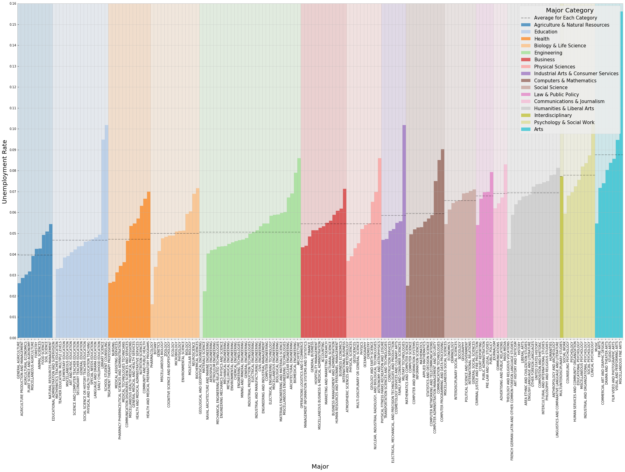
I made three plots of the data. One visualizes the absolute current unemployment rates over a variety of majors and major groupings:

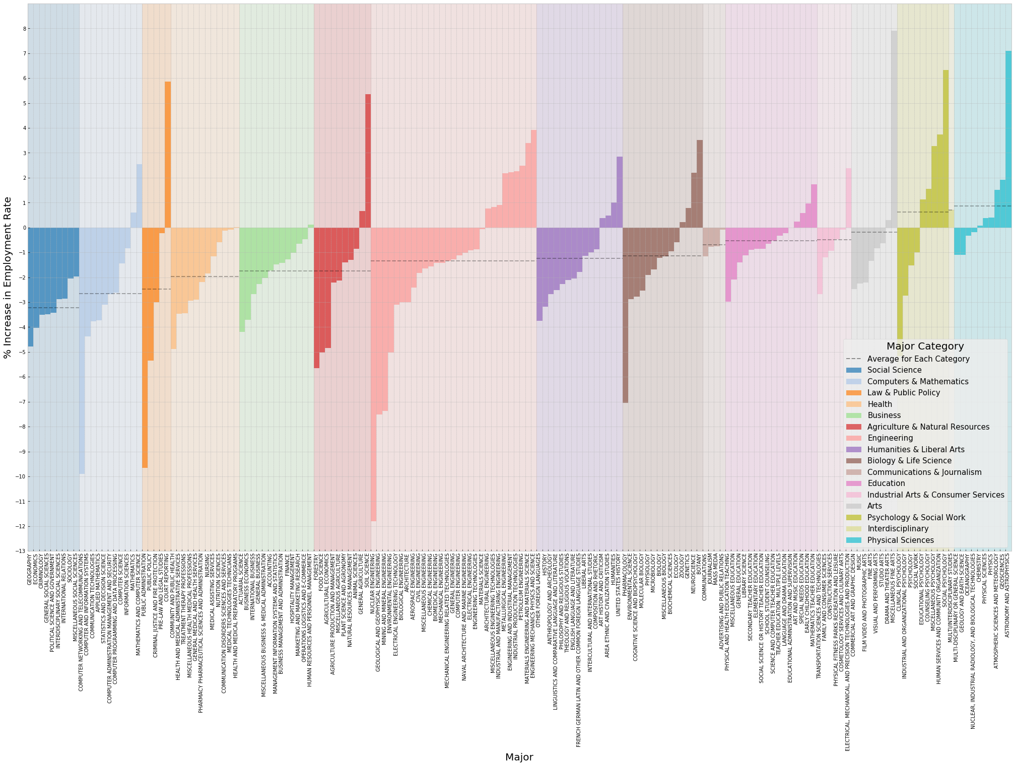
The second visualizes the change in unemployment rate between all college graduates and “recent” college graduates, as defined by FiveThirtyEight:

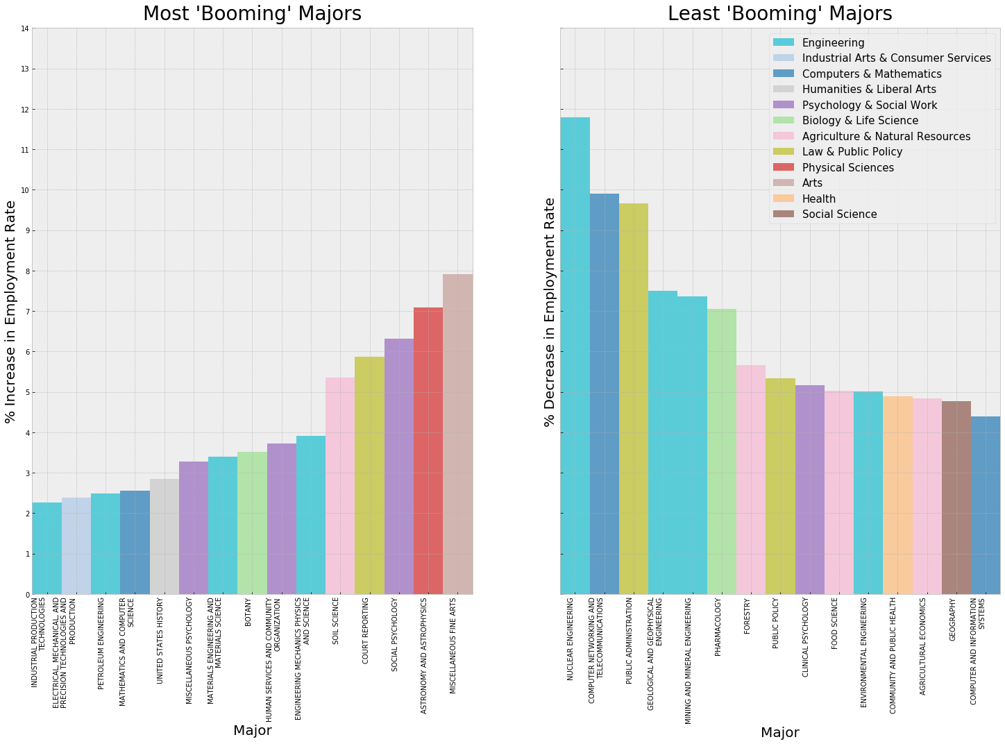
The last visualizes the most/least booming majors, defined by the size of their increase/decreases in employment, respectively:
